PORTFOLIO
Morgan Rogers
Content Strategist

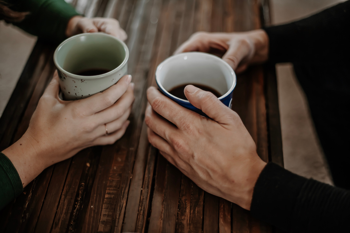
A Little
About Me
I'm a seasoned content professional with a track record of helping organizations connect with their communities through better copy and intuitive content design.
For the last decade, I've focused on digital initiatives to ensure that my clients are providing the right content, at the right time, in the right format to drive business outcomes and a positive consumer experience.

Work experience & Education

Corporate work
NovuHealth (now icario)
- Copywriter (2015-2017)
- Content Strategist (2017-2019)
MOBE
- Content Strategist (2019-2020)
Freelance work
Bunkhouse Creative
- Full-time Content Strategist (2020-Present)
- Part-time Copywriter & Content Strategist (2016-2020)
Education
University of Southern California
- Human Biology, BA
- Spanish, Minor
Freelance clients


Skills & Expertise

Content strategy
- Audits
- Journey mapping
- Content modeling & design
- Content management
- Information architecture
- Persona creation
Copywriting
- Tone and voice
- Health literacy
- Brand guidelines
- Outbound communications
- Psychographic segmentation
Commonly used tools
- Content management systems
- Figma
- Google Analytics
- Microsoft Suite
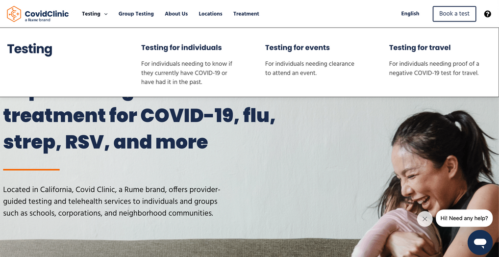
Case study: Build trust and navigate easily to the right Covid test
The opportunity
Covid Clinic spun up rapidly to address the testing needs of communities all over the country. Their first website was slow, didn't effectively capture appointments, and would often lead people to get the wrong test. I was tasked with helping create a new site that got the right test to the right person.
The process
There was a clear need to figure out the root cause of the problem, so the process started with stakeholder interviews. A number of deliverables followed:
- Content strategy statement: Relayed what the content must do in order for the patient and the business to be successful.
- Tone and voice guidelines: Guided the rest of our copy and differentiated between educating (telling someone all the details) vs. informing (getting them from test back to their life as quickly as possible).
- Information architecture: Clearly laid out how to make the site clear and easy to use.
- Excel spreadsheet with all of the preliminary copy: This allowed me to work collaboratively with the designer to lead with copy as opposed to filling it in after design.
The outcome
A website that effectively helps patients and group testing centers navigate to the tests they need without over complicating it.
See it here! https://covidclinic.org/
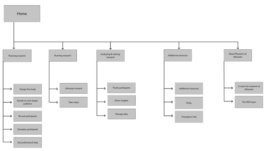
Case study: Increase team efficiency and provide clarity of available resources
The opportunity
The Research team at Atlassian had created a plethora of resources to effectively help non-researchers conduct their own studies, yet no one was using it. They assumed people couldn’t understand which resources to use, at what time. I was tasked with redoing their Confluence site to better meet the needs of non-researchers and encourage more research projects to take place.
The process
I begun with an audit of their current state to ultimately come up with their different user personas, a content strategy statement, and the information architecture. I focused on creating buckets that non-researchers would identify with. For example, instead of "Dovetail" (a tool), the bucket was changed to "Tools for conducting research sessions."
The outcome
An easy-to-navigate Confluence site packed with helpful resources that followed the flow of a research project instead of random ordering. We tested the site with nine different Atlassian employees before rolling it out to everyone. All nine said they now understood how—and when—to use the resources.
See the strategy deck: https://drive.google.com/file/d/1WKD_jI3XMBEKHs1YFTWVo3nOdk5PR5lh/view?usp=sharing
Case study: Provide a comprehensive post-surgery experience to reduce readmissions
The opportunity
The Wound Company is a budding start up that aims to reduce patient readmissions after surgery through easier access to care and better education. I was tasked with creating their entire content strategy from the ground up for their mobile application. This included everything from the UX writing to how to display educational resources in a way that would make them easily consumable.
The process
We started with the most fundamental question: What does someone need to know, at what time, in what format in order to be successful? From there, I worked with different surgeons to journey map what the before, during, and after of each surgery looked like. In addition to informing how users would navigate through the app, this process also guided which educational resources were needed and how they should be displayed. I wrote upwards of 50 different resources and ultimately decided on a format that resembled social media stories for quick and focused learnings on one topic at a time. I also focused on health literacy to meet the user where they needed to be met.
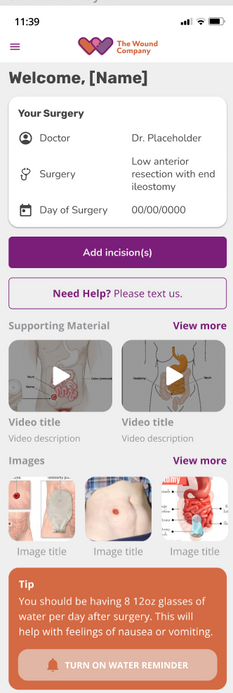
The outcome
A mobile application that allows patients to get help, track recovery progress, and consume the education when they need it. It was written in plain language (everything was written at a sixth grade or below reading level) and free of medical jargon. They are currently in testing phase right now.
See the Abdominoplasty journey map: https://miro.com/app/board/uXjVO2FGdBI=/?share_link_id=641138288206
See an educational resource (before graphics): https://docs.google.com/presentation/d/1BZsUvhvmMRMab9gXBJBxWvJc0yLRtt3K/edit?usp=sharing&ouid=110488015281067588089&rtpof=true&sd=true
Case study: Create an effective intranet for all employees
The opportunity
Northwestern Mutual's intranet had become a dumping ground at best, and completely unused at worst. This was the case for two main reasons:
1. Employees found it too hard to navigate, search didn't function properly, and it was filled with jargon.
2. Teams found it too laborious to up keep.
I joined a team of two other content strategists and three content managers tasked with overhauling the intranet to better serve 7,000+ employees.
The outcome
Over 600 new pages of an intranet were written and designed in Optimizely. This was a big win for three reasons:
- The language reflected how an employee would speak. For example, instead of labeling something "Progyny," it was "Fertility care."
- The content was condensed tremendously allowing us to lessen the cognitive load on the reader. For example, on one page, I cut 100+ links out to Microsoft Help articles and instead added one link to their main help center.
- Through comprehensive style guide and content design work, we created easy to use templates so the teams could be trained to take them over, lessening the burden of upkeep.
The process
Myself and one other content strategist spent months in stakeholder interviews—mapping out what they loved about their content, how it was changing in the future, and its main purpose.
After that, we got to work creating a global navigation, extensive brand and style guidelines, and rearranging and redistributing pages, sections, and teams. We brought an employee-focused lens to everything we did and advocated on behalf of ease of use and understanding. I wrote many sections and worked collaboratively with the content manager to ensure the design of the page lent itself to the best possible experience.
Let's work together!

morgan@morganmckinsey.com

(952) 452-1272